

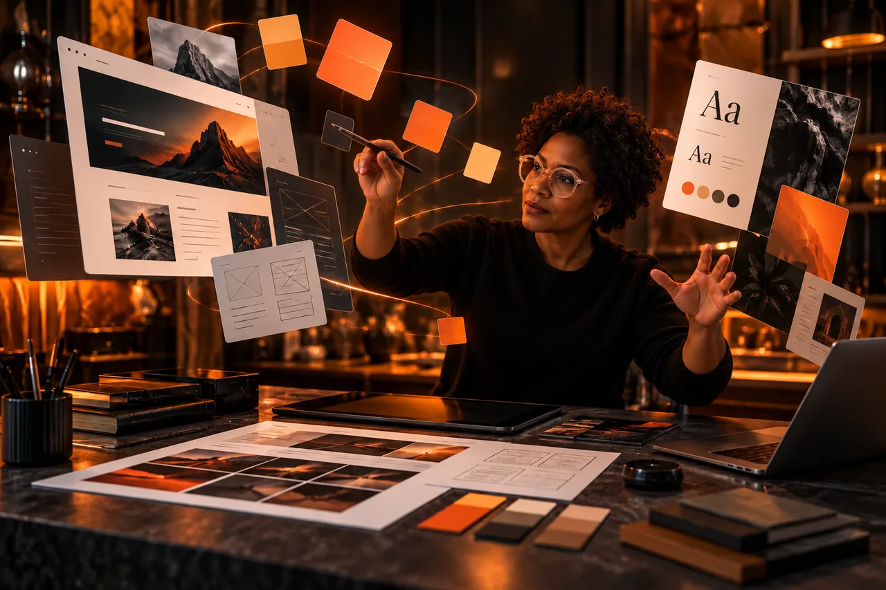
Create a website, it's not just lining up buttons and pretty images in the hope that the user will be amazed. No, it’s a subtle art, somewhere between the magic of design, common sense and… a little psychology. And sometimes a hint of good taste doesn't hurt either.
Here then, in complete relaxation, best practices in web design, the frequent blunders that we still come across (alas), and a little color guide so as not to transform your site into a traffic sign.
What you absolutely must prioritize in the design of your site
Smooth navigation (not a treasure hunt)
Your menu should not look like an escape game. If a visitor needs 3 clicks, a map and a GPS to find your services, it’s a failure.
Opt for:
- Adapted to your sectorA clear, visible menu, not hidden behind three icons.
- A logical structure: Home → Services → About → Contact. Classic, but it works.
A well-thought-out visual hierarchy
The visitor must understand, at a glance, where he is, what he can do, and why he would stay here rather than elsewhere.
Visible titles, buttons that stick out, well-managed spaces.
No need to overdo it: we’re not at Web Fashion Week.
A site that loads quickly (otherwise, goodbye)
If your site takes 12 seconds to open, it’s a safe bet that the visitor will have had time to make a coffee… elsewhere.
Optimize your images, avoid animations that shine like a Christmas tree, and choose a good host.
Responsive design (yes, even on connected fridges)
More than half of your visitors will come via mobile. If your site appears like an old Excel file on a smartphone, no.
Design errors to avoid like the plague
Overloaded site syndrome
Images that flash, music that starts on its own (yes, it still exists), 14 different fonts… Stop. Give your visitors some breathing room.
Golden rule : When you think it's good, remove two more items.
Questionable readability
Tiny font? Light gray text on white background? Medieval Gothic style font?
Make it simple, readable, accessible. We are not doing a vision test, we want to convey a message.
Forget the mobile version
If your site looks like a messy Tetris on a phone, you're losing people. Lots of people.
The absence of a call to action
A site without a “Contact us”, “Reserve”, “Order” button? It's like a shop window without a door.
Don't leave your visitors alone in nature. Direct them!
And the colors in all this?
Good surprises:
- Blue : confidence, seriousness, ideal for professionals.
- Green : reassuring, zen, perfect for the environment, health.
- Yellow (in small doses) : energy, warmth, but watch out for your eyes.
- Black & white : sober, elegant, efficient.
Colored traps:
- Fluo : Unless you sell highlighters, avoid.
- Low Contrast Combos : light gray on a white background = the reader's nightmare.
- The whole rainbow : a site is not fireworks. Two or three well-chosen colors are enough.
In summary (without making a PowerPoint)
A good website design, it is:
- Clarity,
- From logic,
- Speed,
- And a little style (without going overboard).
And for that, calling on a web design pro is often what makes the difference between a “meh” site and a “wow” site.
Need a helping hand to (re)design your site without falling into the pitfalls mentioned? Maybe it's time to join the light side of the force (and no, we're not talking about Instagram filters).